3 months
2020
2025 Individually updated
RGD Honourable Mention Intent Award for Accessible Design
Research
UX/UI
User testing
Zainab Alavi David Ngo
Lian Sin
Figma Illustrator
Managing your medical routine is hard
Managing medication can be difficult; more than 1 in 5 adults aged 40-79 years take 5 or more prescription medications.
Errors in medication are the most common cause of injury and the most preventable
According to the NIH, potential areas where medication errors can occur are in the prescribing, ordering, and administration stages. Common effects are: incorrect doses, unknown allergens, and inadequate patient education.
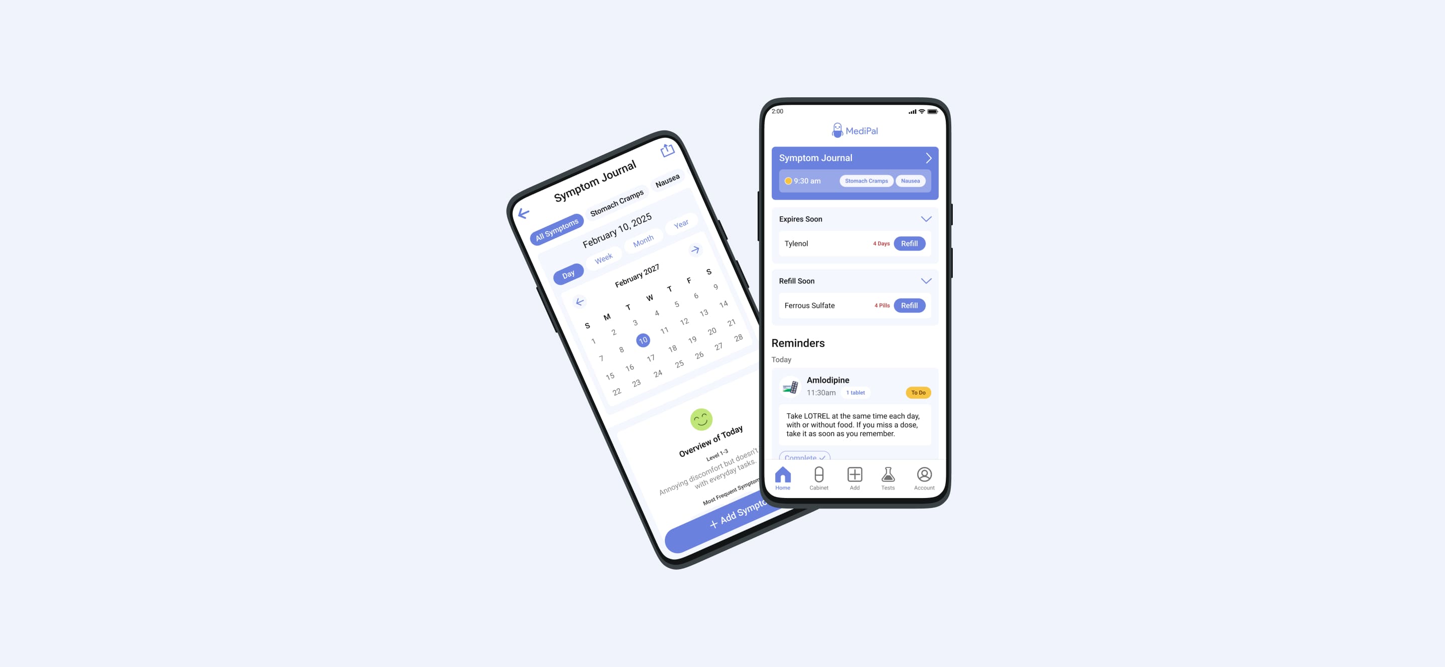
Symptom monitoring & self-care management
Symptom tracking is crucial, particularly for people with chronic conditions. By monitoring symptoms – their severity, frequency, and medication relief – individuals can better understand triggers and improve quality of life.
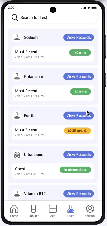
Medical records
Access to personal healthcare records, such as test results, clinical history, and hospital discharge summaries allows you to monitor changes, easily share information with medical personnel, and ask informed questions.
Research
Ideation
Refinement
The first step in defining the key features of our product was analyzing scholarly articles and conducting user interviews to better understand our audience and align with user goals and expectations.Our PACT analysis of medical tracking products reveals a gap in the market, where there are few applications tailored for older audiences, patients, and caretakers. Many have complex interfaces with high manual data entry that place a burden on users.
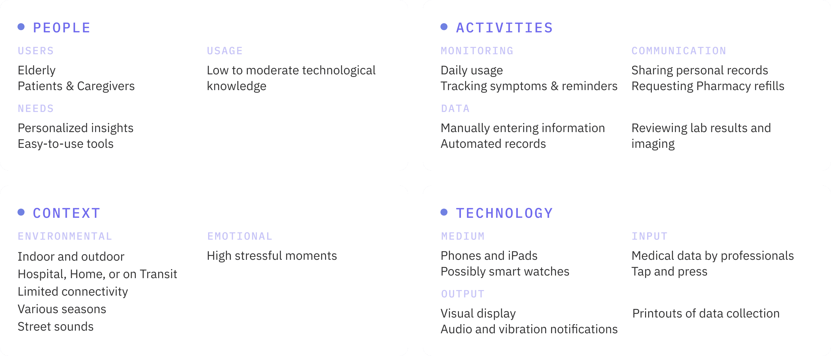
Key Insights
It is relevant to note that our user and competitive analysis research brought to attention the importance of ensuring that the application doesn’t replace communication between patients and healthcare providers, but rather encourages collaboration as patients assume active roles.
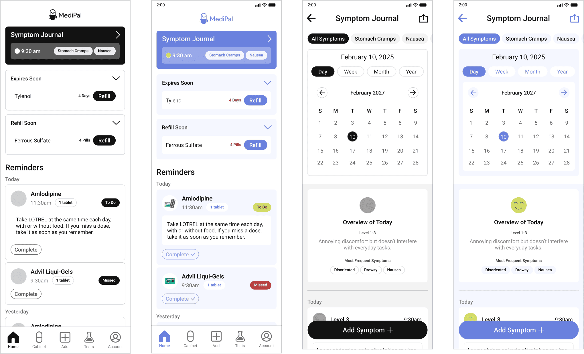
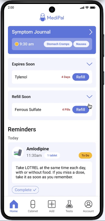
In order to create an intuitive and streamlined interface, the app focused on four features: setting reminders for medications and supplements, tracking medications in your home, documenting symptoms, and quick access to health records.
Research

Ideation
Refinement
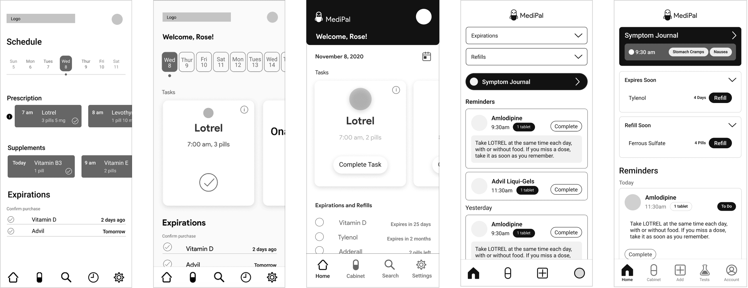
Considering our insights, we began to design wireframes. Our development process featured multiple iterations, deliberately dedicating time in refining our mid-fidelity wireframes and user experience design before applying our branding.
When comparing earlier versions of our application, there are clear improvements in hierarchy, visually organization, and better understand of user needs. From left to right, these versions are visual chapters the project’s development.
Navigation
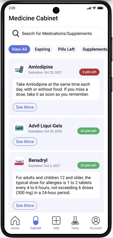
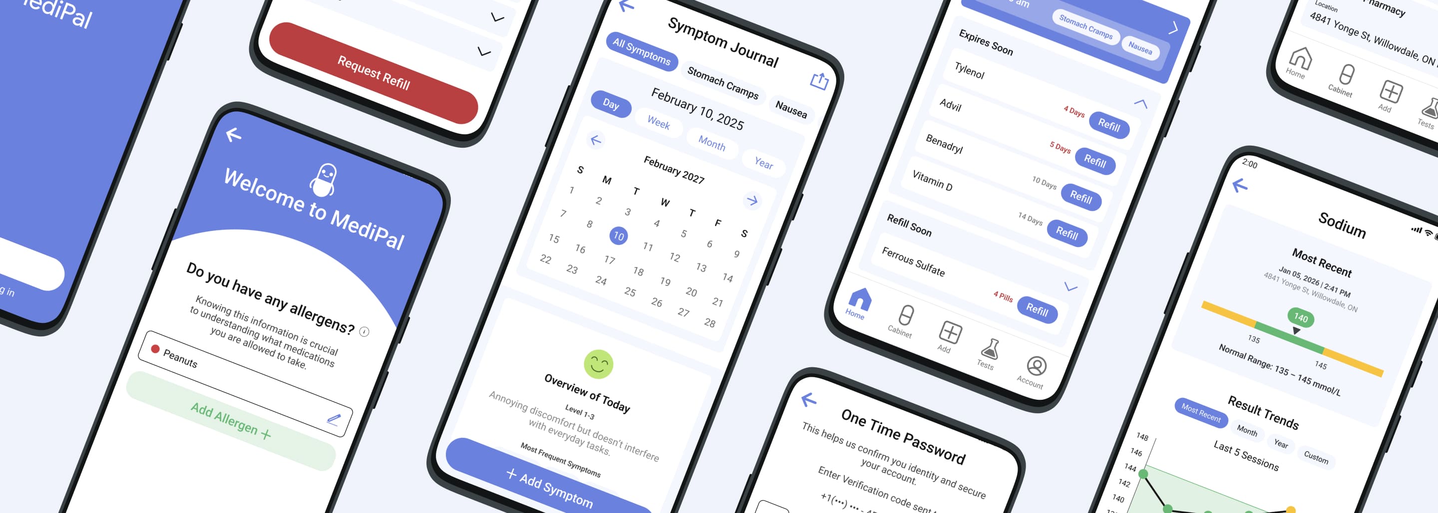
The two tabs in the bottom navigation bar that remained consistent throughout the design were ‘Home’ (with reminders, expirations and refills) and ‘Medicine Cabinet’.
The initial design emphasized the importance of a tab that stored all your reminders. However, through multiple iterations and user testing, it was brought to attention that the section was confusing for users, as they could already access that information on the home page. It was replaced with ‘Tests’, a feature patients should have ready access to.
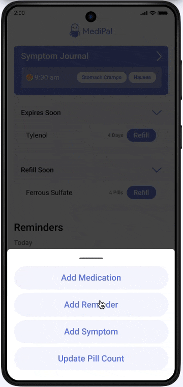
And while an important feature was patients adding or searching for new medication, upon first glance, the ‘Search’ tab feature isn’t clear. What is the user searching for? Can they only search for medications? To remove confusion, it was replaced with an ‘Add’ tab, where users could add reminders, symptoms, update pill count, and add or learn about new medications.
The ‘Account’ tab was highlighted for quick access to emergency medical information, and the ‘Settings’ now resided in it.
Home Tab
While the initial design had our core features, it was cluttered, inconsistent, unintuitive, and lacked key user information and call-to-action buttons. To make it more consistent and user-friendly, it was refined with attention to typography, visual hierarchy, and providing macro and micro information at a glance.
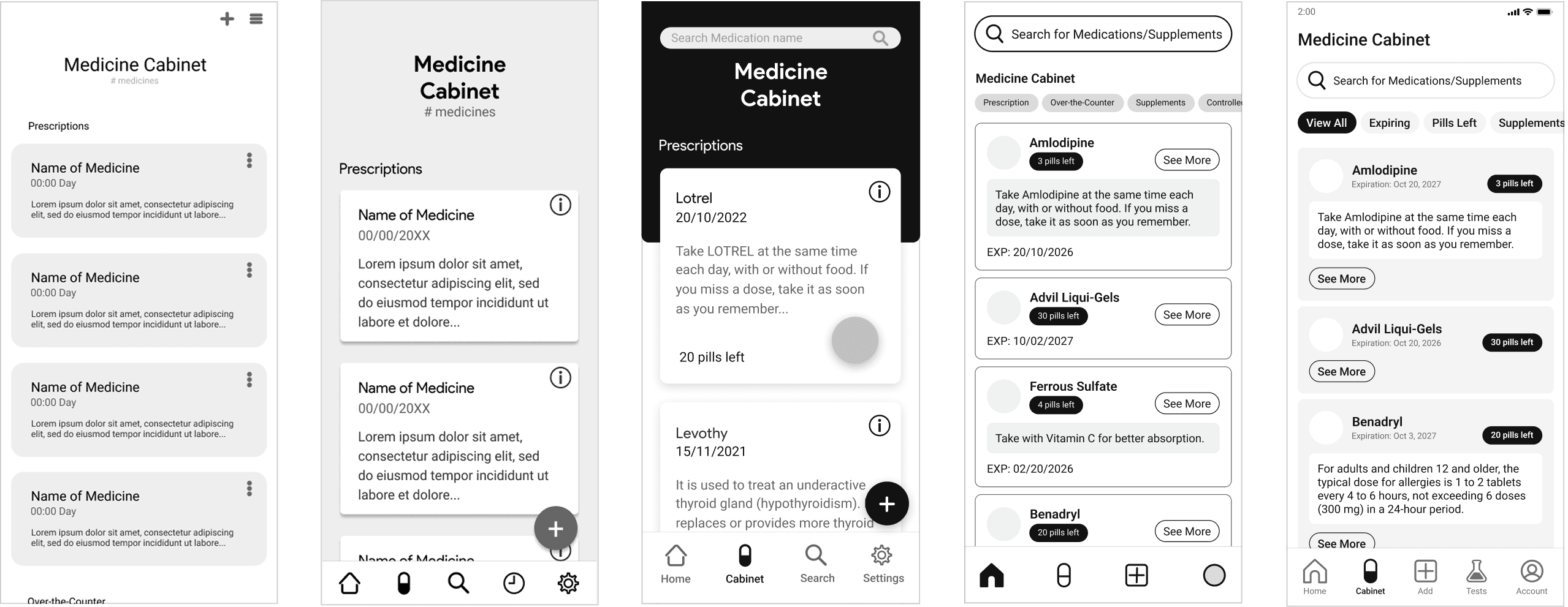
Medicine Cabinet
In comparison to earlier iterations of the ‘Medicine Cabinet’, the most recent design has a distinct hierarchy of information. For example, pill buttons that filter your medications and medicine cards organized by a photo of the pill container, its name, an expiration date, pills left, and a ‘See More’ button.
Research
Ideation
Refinement
During this phase, we implemented our banding, using selective colours to emphasize important features. Pages were also further refined to ensure consistency.