2021
Research
Visual Design
Illustration
Branding
Illustrator
Photoshop
Indesign
Printing
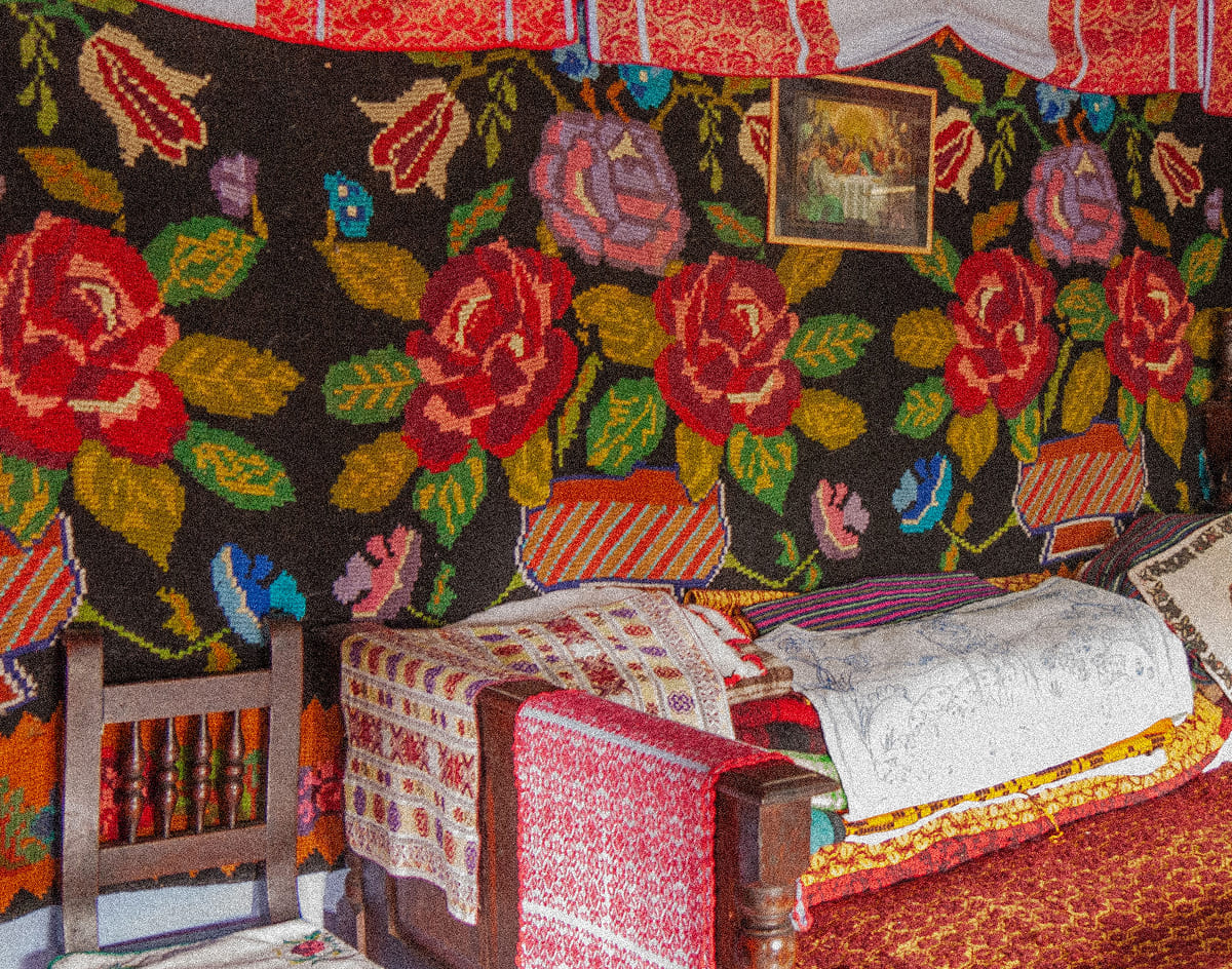
As a child, I spent many summers visiting my grandmother in Romania, in the foothills of the Southern Carpathians. One of my favourite pastimes was helping her tend to her garden and take care of her chickens. We would wake up early in the morning to feed the chickens, let them roam free, clean their coop, and collect eggs. Throughout this daily ritual, she told me stories from her youth and taught me Romanian traditions and life skills. One of these skills, which became a subconscious ritual in my adult life, was reducing food waste. You see, whenever we cooked eggs, we would save the shells, grind them down and later use them as fertilizer in the garden. Almost none of our food waste would be thrown away; a lot of it was repurposed.
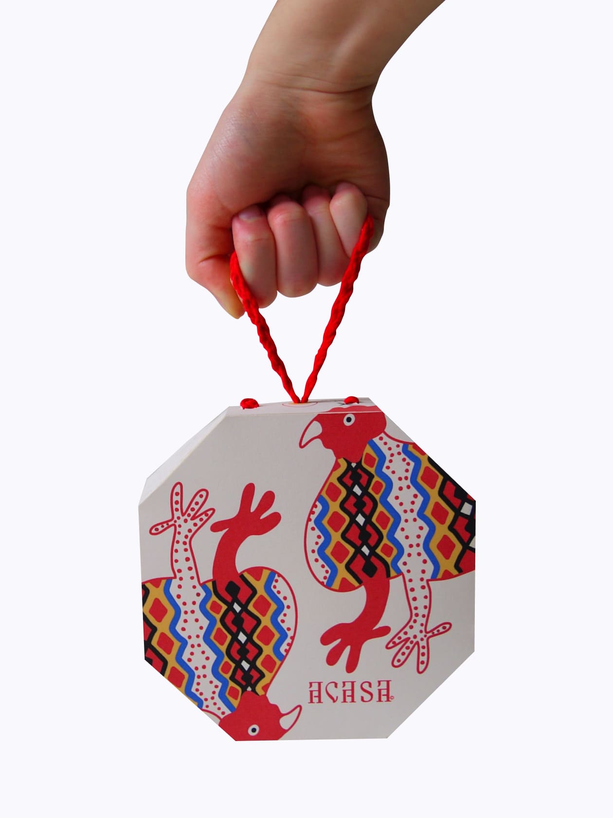
When prompted to regenerate an existing packaging design, I knew I had to choose egg packaging. Using a more recent statistic, just in Canada in 2024, egg farmers produced 915 million dozen eggs*, that’s a lot of egg cartons. Through Acasa, I wanted to draw attention to the importance of waste reduction and growing your own produce through my cultural lens.
.jpg)
Goals & Objectives
Introduce the Romanian language, writing, and folk culture to a global audience.
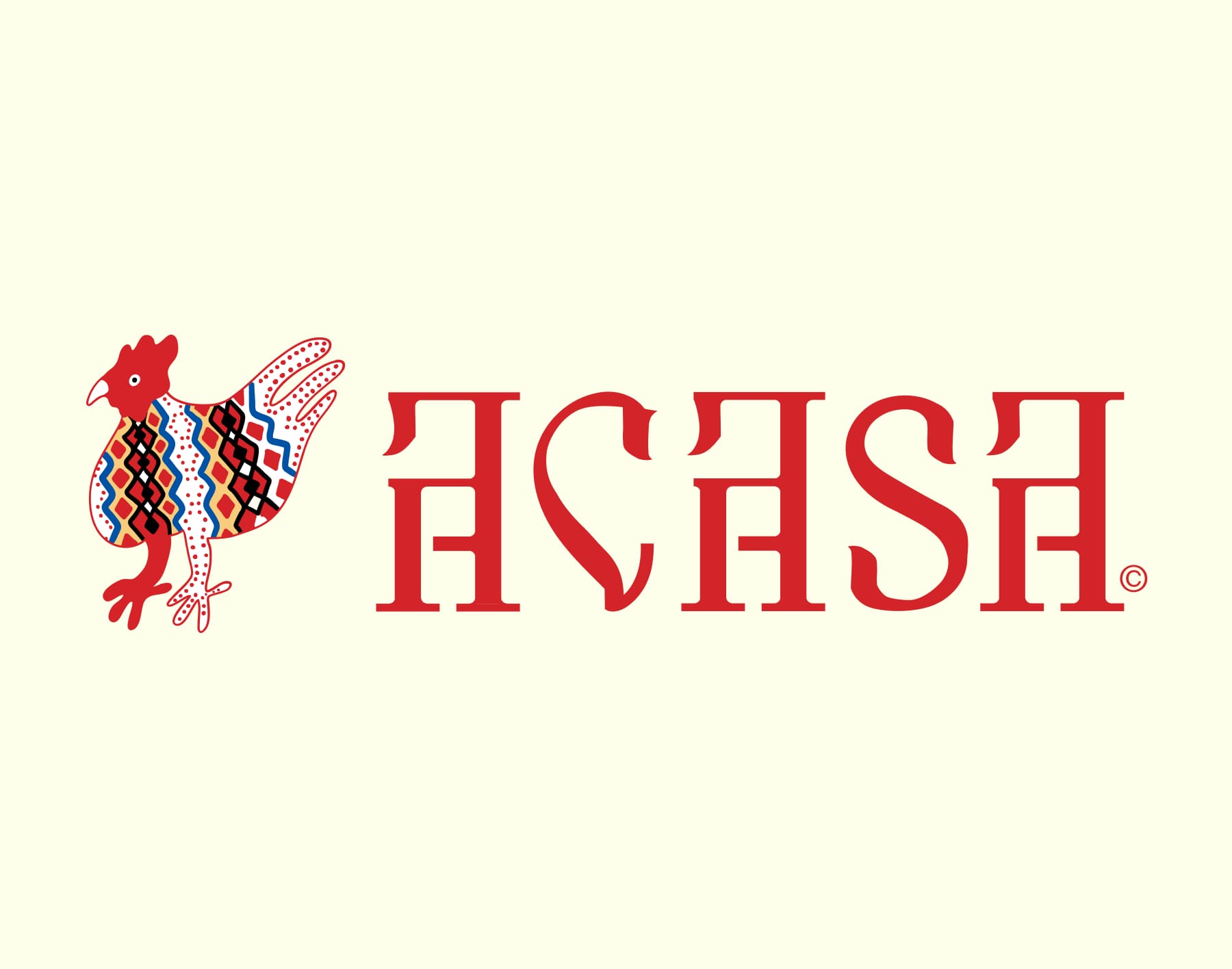
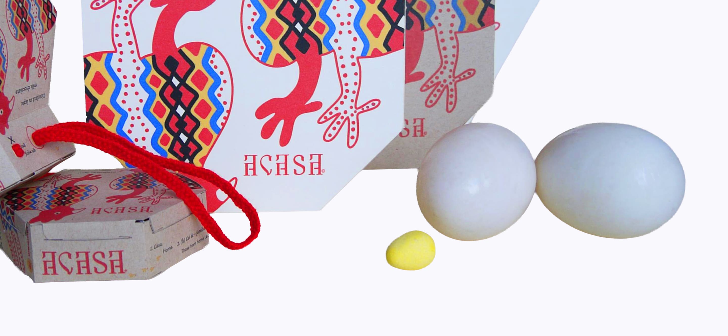
Brand Name
Acasa is directly translated as Home or those close from home, i.e. family, a concept that is deeply engrained into the Romanian culture and this brand.
Logo
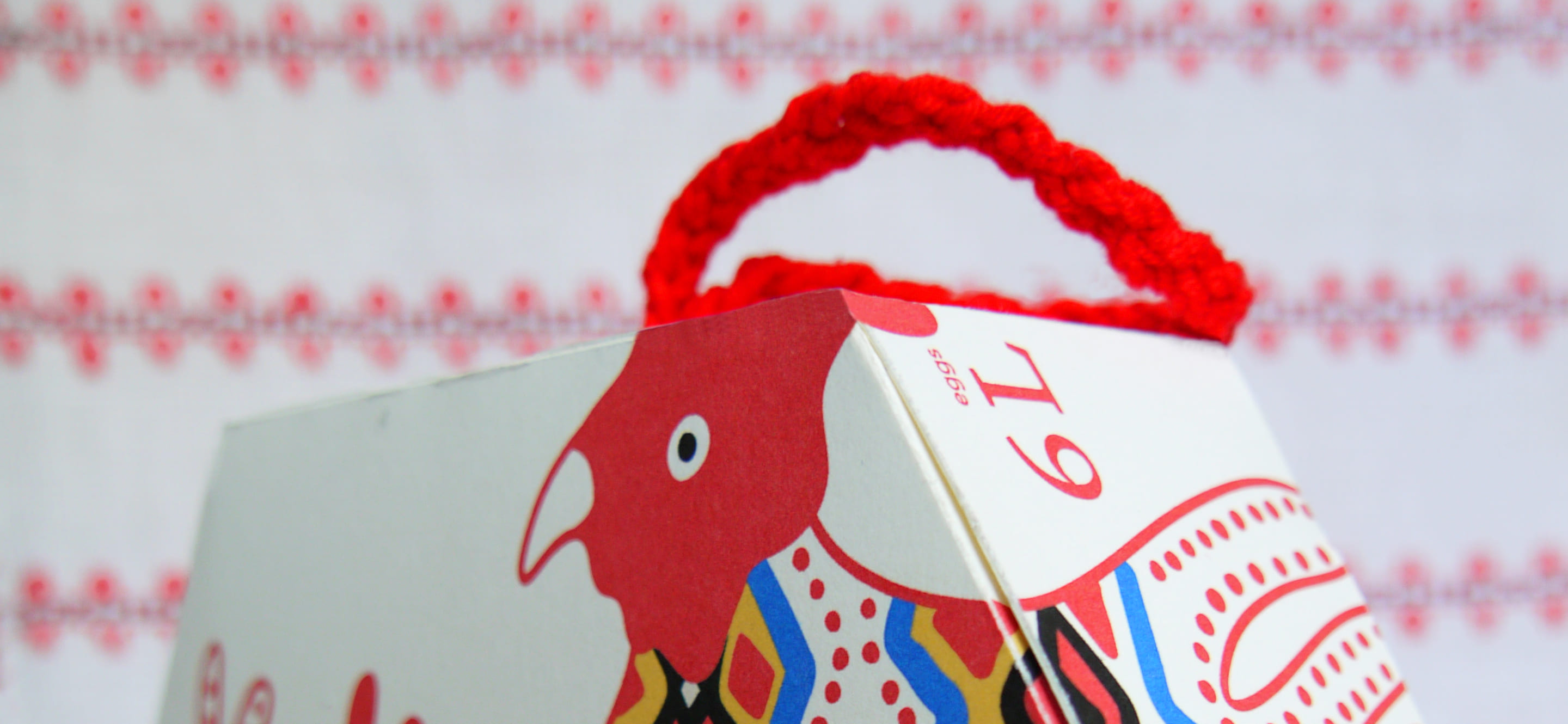
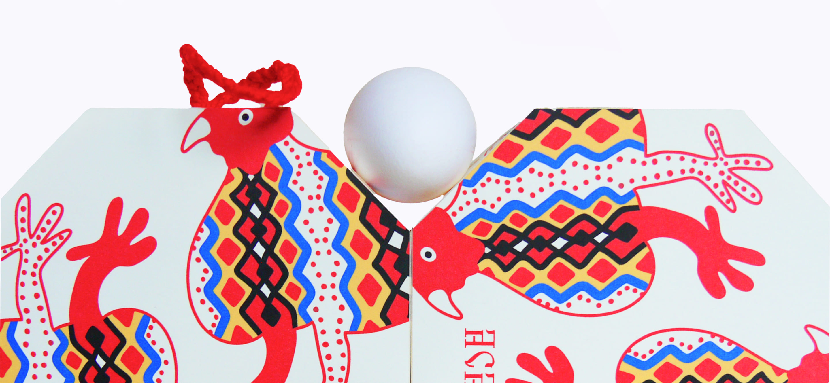
The brand uses five folkloric colours – white, yellow, red, blue and black. The rooster or hen references the significant role chickens played in my childhood. It is also an prominent symbol in Romanian folkloric art.